Why Two Years Won't Suffice: Unveiling the Drawbacks of Limited Data
Debunking the Police, Part 2
Written by Craig Sloss, Edited by Fitsum Areguy
It’s important to recognize that relying on just two data points is never a reliable way to identify a trend. Surprisingly, the Waterloo Regional Police Services (WRPS) has regularly cited “trends” based on only two years of data to support their proposal for an $18.3M budget increase for 2023.
Introduction
This is the second instalment of a series of six newsletters I decided to publish following a series of Twitter threads I posted in the lead-up to the Regional Council’s vote on the budget. The first issue of the newsletter highlighted how decisions made by data analysts can introduce subjectivity into their conclusions. Building on that theme, this issue aims to demonstrate how the decision to emphasize year-over-year changes, rather than a comprehensive multi-year trend analysis, leads to misleading conclusions.
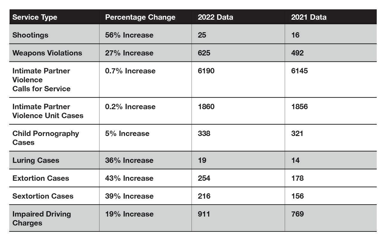
The table below is derived from Appendix C in the WRPS budget justification memo titled “Crime Trends in Waterloo Region from 2021-2022 (WRPS)”. The rows highlighted in grey were cited in the main text of the memo.
For this issue, I'll use data from Statistics Canada’s Uniform Crime Reporting (UCR) Survey to demonstrate how using only two years of data can lead one to conclude that something is trending when a trend does not actually exist, or to overestimate the size of a trend that does exist. I’ll contrast this with an example that shows a situation in which a year-over-year statistic does provide meaningful information.
Year-over-year changes have no predictive value
Understanding relevant trends is crucial when using data in the budgeting process as budgets focus on future planning, while data reflects the past. A trend is a general pattern of change in a statistic over time, that we expect to continue.
For example, the memo highlights a 56% increase in Shootings between 2021 and 2022. However, this isolated change does not provide enough information to determine if this is a trend that will persist in the upcoming year. The statistics that WRPS reported in Appendix C would be more accurately described as “year-over-year" changes rather than trends, but the problem goes beyond merely mis-naming the stats – year-over-year changes often have limited predictive value for future outcomes.
There are a few key differences between the WRPS data and the UCR that prevent a direct comparison, but the UCR is still useful for demonstrating the concepts that should have been applied to the WRPS data:
- The UCR data does not include “Shootings” as a category of incident, so instead I used the category “Total firearms, use of, discharge, pointing”.
- The UCR classifies incidents according to the most serious violation occurring in the incident, so, this category would exclude situations in which a firearm was used in an incident that got recorded as a more serious crime.
- Two categories of firearm incidents (using a firearm in commission of an offence and pointing a firearm) were added to the UCR in 2008, so to avoid the impact of the change in definition, we should limit our trend analysis to 2009 and later.
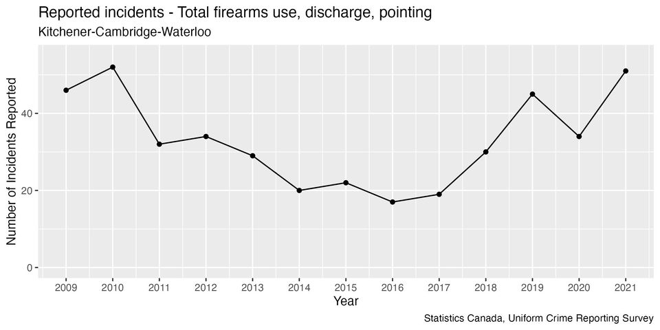
This graph shows the number of firearms incidents reported to police in each year:
Between 2009 and 2020, there were six years when this statistic saw a year-over-year increase, and in four of these there was a decrease the following year. In other words, if we had used year-over-year increases to conclude an increasing trend, we would have been wrong more often than we would have been right.
Looking at multiple years of data helps us put the year-over-year changes in context. The reason that a single year-over-year measurement of the number of firearms incidents doesn’t tell us much about what will happen in the future is because the year-over-year changes in this statistic go up and down, constantly changing.
The value of calculating a trend using multiple years of data is that it considers the possibility that there can be both increases and decreases to the statistic on a year-over-year basis. After accounting for the combined impact of both increases and decreases, is the general direction increasing or decreasing?
In the previous article in this series, I showed that trend analyses are often subjective because the conclusion will vary based on what year the analyst decides to start the trend line from. In the case of the UCR firearms incidents data, the conclusion is ambiguous:
- If we use all the data going back to 2009, there is no indication of a trend; instead, it looks like the statistic oscillates around an average value of 33.
- If we start the trend line between 2011 and 2017, we would conclude that there was an increasing trend, with the size of the increase varying between 5% and 23% depending on where the line starts from.
If we “cherry-pick” the starting point to get the largest possible trend value, we would conclude a 23% increasing trend by starting the trend line from 2016. However, two of the year-over-year increases in this time period are 50% or higher, which is more than double the most extreme result we would get from a trend analysis. This brings us to the next topic...
Using only two years of data can overestimate the size of a trend
Even in cases where there is clear evidence of a trend, relying on only two data points can result in an overestimate of the size of the trend. The WRPS cited a 36% increase in luring cases as part of their justification for their budget increase based on the change in the number of cases between 2021 and 2022. Let’s examine the data from the UCR to gain a clearer understanding, adding a blue curve that represents the trend calculated using all years of data available:
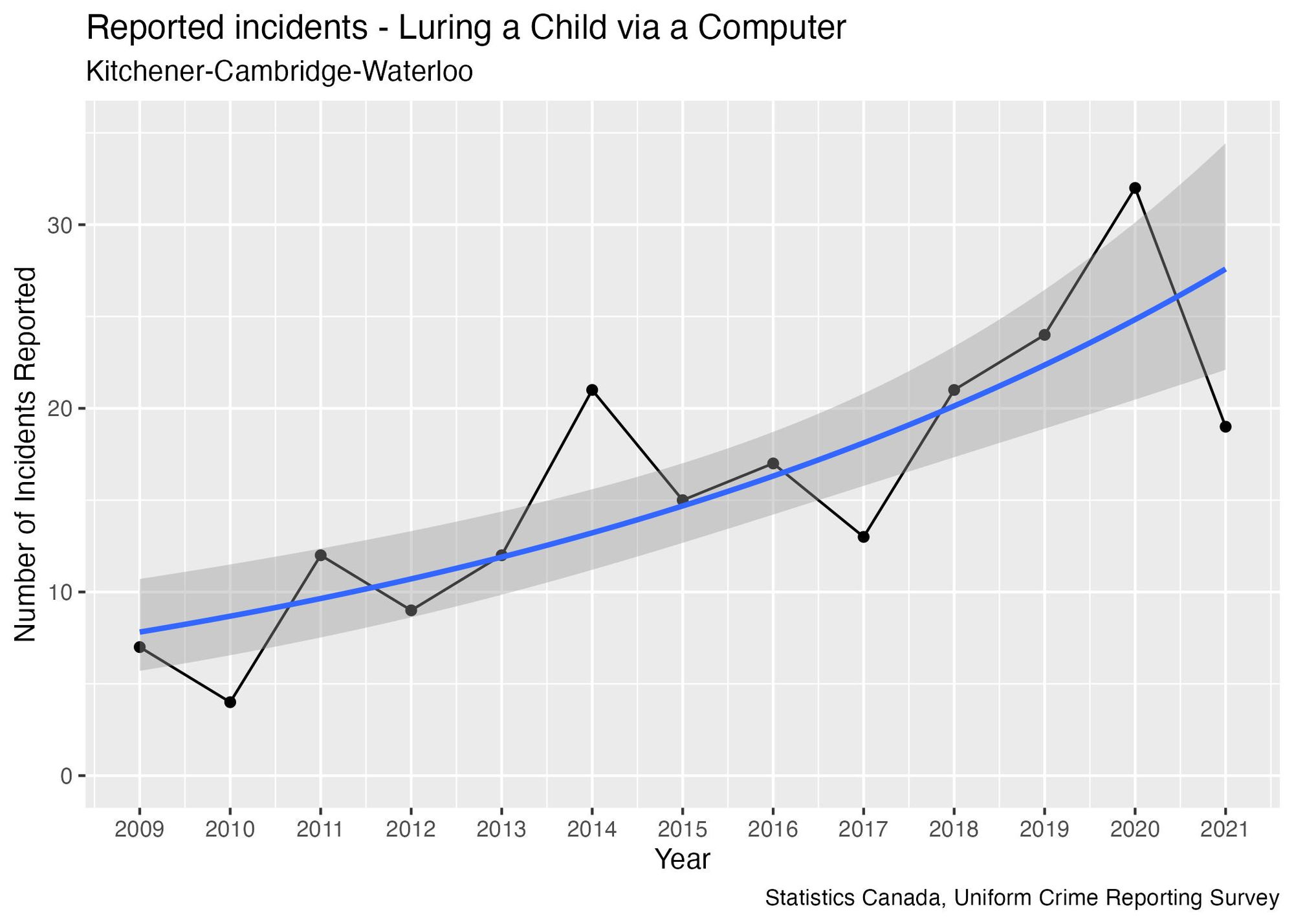
The UCR data does show evidence of an increasing trend. Visually, this is what we expect a trend to look like: although there is some up-and-down change in the year-over-year numbers, the points tend to oscillate around a line that is increasing rather than one that is flat.
Where the WRPS memo becomes misleading in the size of the trend. I calculated an 11%-per-year increasing trend over the time period 2009-2021, but the year-over-year statistic reported by WRPS is more than triple this number, exaggerating the size of the increase.
One of the reasons the year-over-year number is exaggerated is because the UCR data reveals that 2021 was an unusually low year compared to other recent years, and starting from a low point will exaggerate the size of the increase.
Using percentages to measure changes can sometimes lead to an exaggeration of the magnitude of a change when the underlying numbers are small. This occurs because even slight changes in the number of incidents will result in large percentage changes. For example, the reported 36% year-over-year increase is driven by only 5 additional incidents. Looking at the size of changes in the past can help put the 2022 numbers in context:
- The smallest year-over-year change observed was 13%, already higher than what we would get from a trend analysis. In other words, every year-over-year change for this data overestimates the trend’s size.
- Half of the time, the size of a year-over-year change exceeded 33%. So, for this statistic, a 36% change falls within the range of relatively typical fluctuations.
- The largest year-over-year change was a 200% increase, when the number of incidents went from 4 to 12 in 2011.
A more realistic trend based on multiple years would correspond to around 1-2 additional incidents per year. Keeping in mind that this statistic was presented in support of a budgetary decision, I would question why it was included, since a change of this size is unlikely to have a material impact on the overall budget. Statistics like this are being misused to support a fear-based justification for the budget, rather than a justification that is based on revenues and expenses. (I’ll discuss the topic of selecting statistics that are relevant to the decision in a future article.)
The WRPS budget memo presents another assertion that relies on only two years of data:
Additionally, over the last decade, the Total Crime Severity Index (CSI) in Waterloo Region has gone from 59.19 in 2012 to 79.0 in 2021, an increase of 34%.
I’ll explain the Crime Severity Index in a future article, but for now let’s focus on the interpretation of these numbers. This is different from the year-over-year numbers because it is comparing statistics from two non-consecutive years while disregarding data for all the years between them. This means the reported 34% value represents a cumulative change over a 10-year period. To understand its relevance for a one-year budget approval, we need to examine the annual trend—which works out to around 4% if we fit a trend line going back to 2012.
The decision to use 2012 as a reference year for this calculation was a choice made by the analyst. Therefore, we should test what happens if we select other years as the reference year:
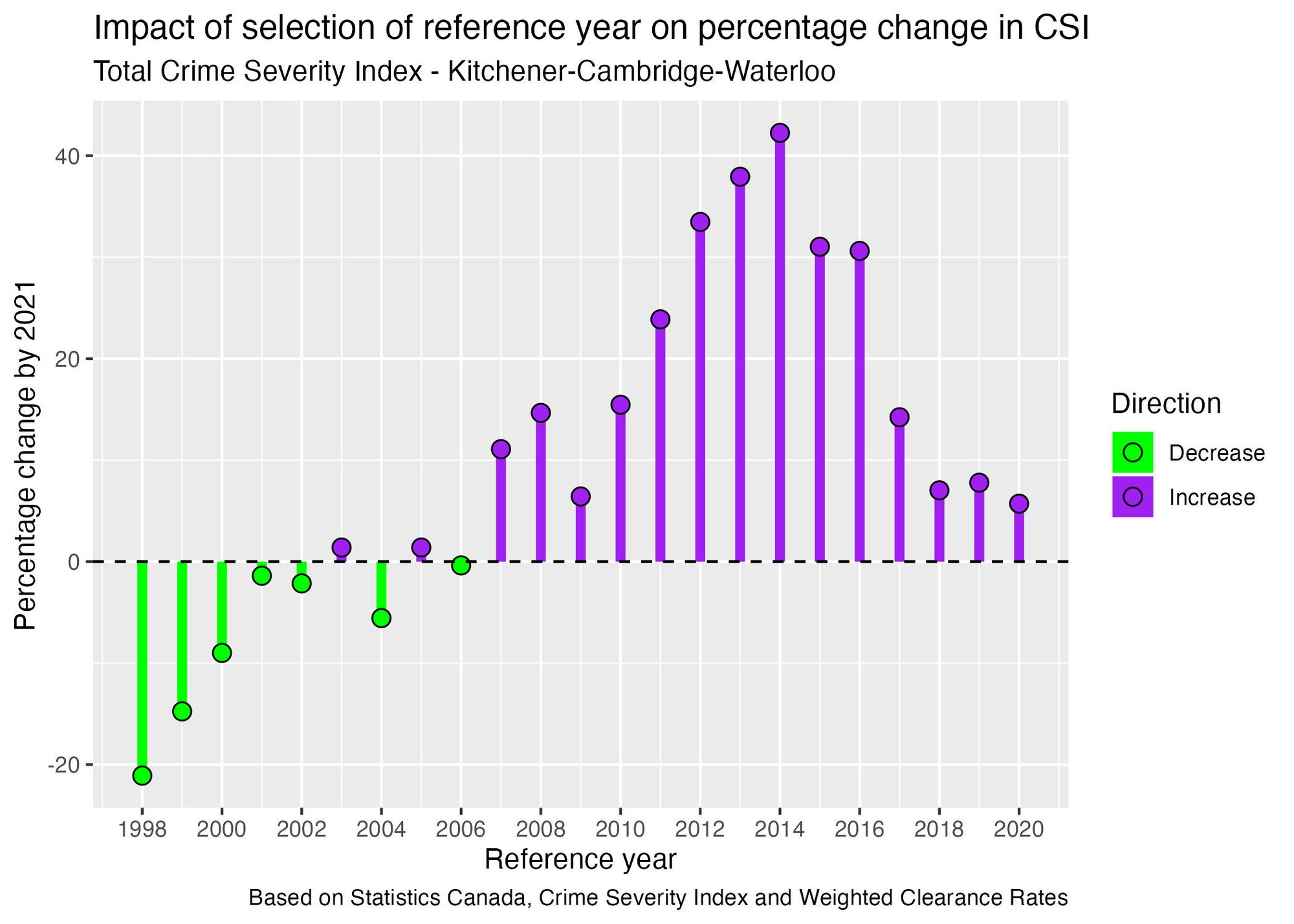
The choice of a reference year significantly influences the outcomes, leading to a wide range of results. Depending on the reference year selected, we obtain results ranging from a 21% decrease to a 42% increase. This huge disparity reveals how much subjectivity there is in the selection of a reference year. Interestingly, using 2012 as the reference year yields the third-highest result, while opting for more recent years like 2018-2020 consistently yields percentage changes below 10%. Therefore, the decision to choose 2012 as a reference year leads to an inflated result compared to other possible choices.
When are Year-Over-Year Changes Meaningful?
Although year-over-year changes may not accurately predict what’s likely to happen in the future, they can still provide valuable information in certain scenarios. The rate of reported thefts over $5000 is one example:
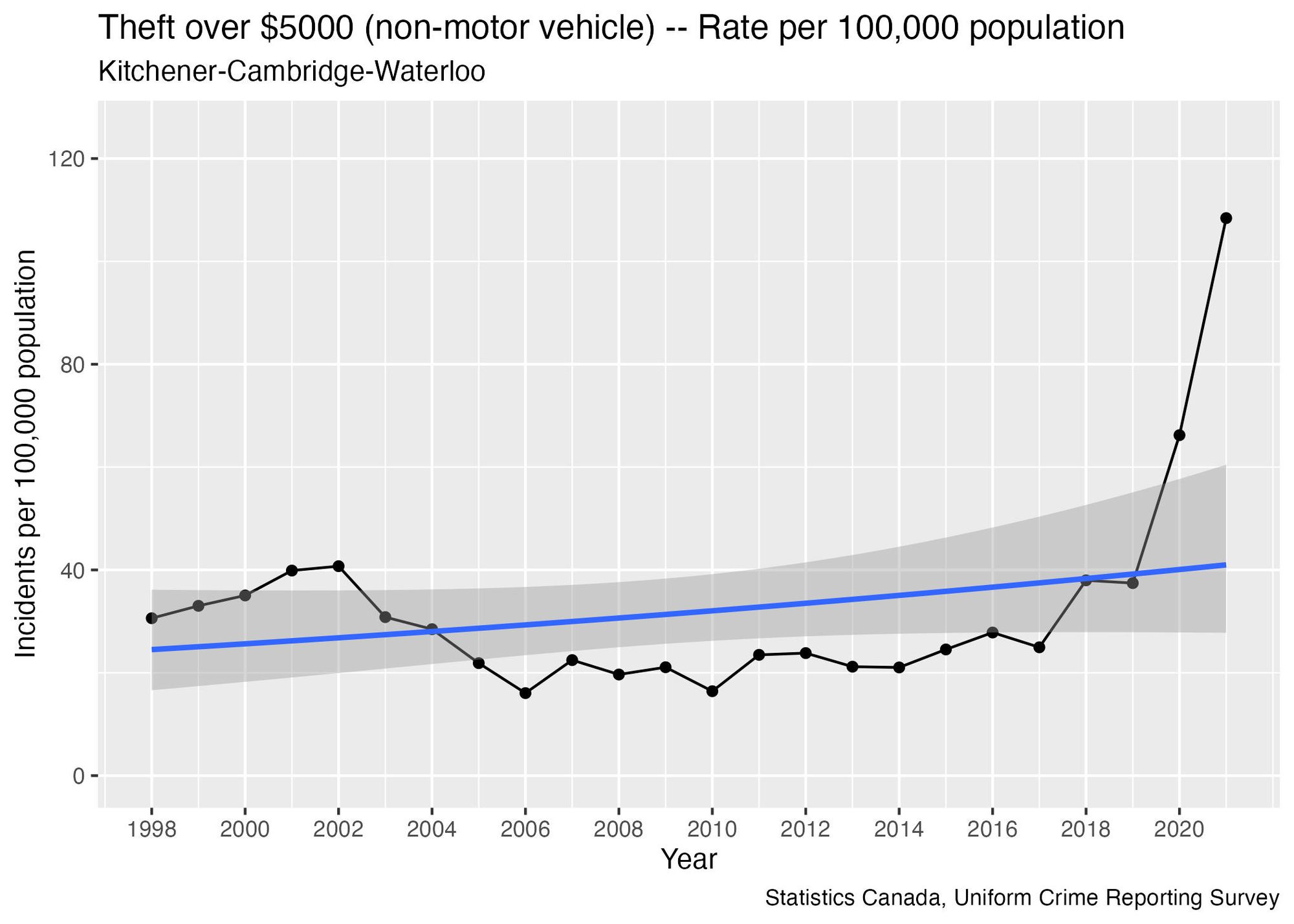
There are large jumps in the rate in 2020 and 2021. Adding a trend line to the graph shows that describing the situation as a "trend" is inadequate—it doesn’t capture the sudden surge in recent years.
Prior to 2020, the median size of a year-over-year change was 12.5%—in other words, half of the year-over-year changes were larger than this, while the other half were smaller. This gives us a rough idea of the typical magnitude of changes observed in the past. However, 2020 saw a 77% year-over-year increase, followed by a 64% increase in 2021—both surpassing any previously recorded upswings.
The abnormal magnitude of these increases suggests the presence of an underlying change that needs to be understood to plan for the future. As this is an economically-motivated crime, one plausible explanation is that the jump in rates stems from economic pressures associated with the Covid-19 pandemic.
Large jumps like these suggest two possibilities, distinct from a conventional trend where historical increases are expected to continue in the future:
- A “change in level” scenario, where the rate stabilizes around an average higher than what we’ve seen in the past. This would represent a “moving to a new normal” situation.
- A “one-time event” scenario, in which the rate returns to historical levels within the 20-40 range, after the factors contributing to the jump have subsided.
The question of which situation we're in cannot be answered solely through statistical analysis. It requires a deep understanding of the underlying phenomenon driving the jump in the rate. Having an understanding of what is driving the changes in reported crime rates would allow for more informed discussions concerning appropriate actions to take in response to the change—is this a policing problem, or a problem in which more economic supports are needed?
The key takeaway from this discussion is that relying solely on single year-over-year changes isn’t an effective approach to future planning. Examining data from multiple years can help put the size of the changes in context, and a trend analysis can account for the combined effect of both increases and decreases in recent years. Establishing a baseline for the typical size of year-over-year changes in the past allows us to identify situations where the size of the change is unusually large, warranting further investigation.
It’s vital to recognize the subjectivity inherent in data analysis and question the decisions made during the analysis. By assessing the consistency of results under different decisions, we can gain deeper insights into the reliability of the analysis.
Coming up in the next issue: you may have noticed that in the table in the introduction, the WRPS only listed types of crimes with year-over-year increases, and none that showing decreases. I’ll dive into examples of crimes where the reported rate is decreasing, demonstrating how the table is misleading through selective omission.
If you’re interested in using my code to conduct your own analysis on this data, you can find it in this file on my Github repository: https://github.com/craig-sloss/questioning_the_numbers/blob/main/police_data/02_using_more_than_two_data_points.Rmd