Appendix for "Making Sure You Get the Full Picture"
This page contains a more detailed explanation of two pieces of analysis that were summarized briefly in the issue Making Sure You Get the Full Picture.
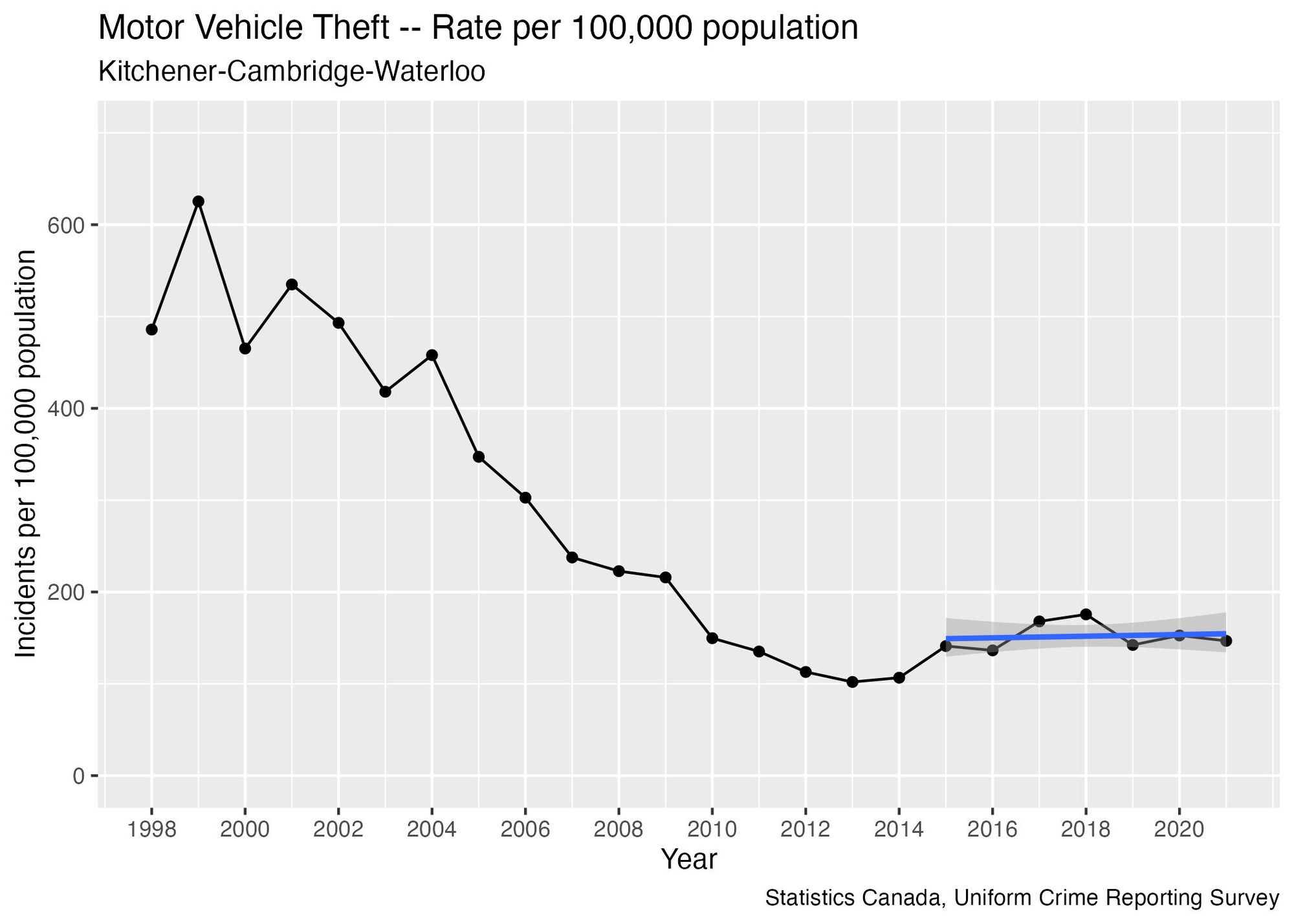
Motor Vehicle Theft
At a high level, the pattern for Motor Vehicle Theft is similar to the Breaking and Entering graph in the main article: there’s a long-term decreasing trend that doesn’t capture what’s happening with more recent data. The rate reached a minimum in 2013, then slightly increased and leveled off:
Analyzing various trend lines with different starting points confirms that the trend's direction depends on the starting year. If you start around 2011-2013, it appears to increase, but this medium-term trend seems to have stopped in recent years:
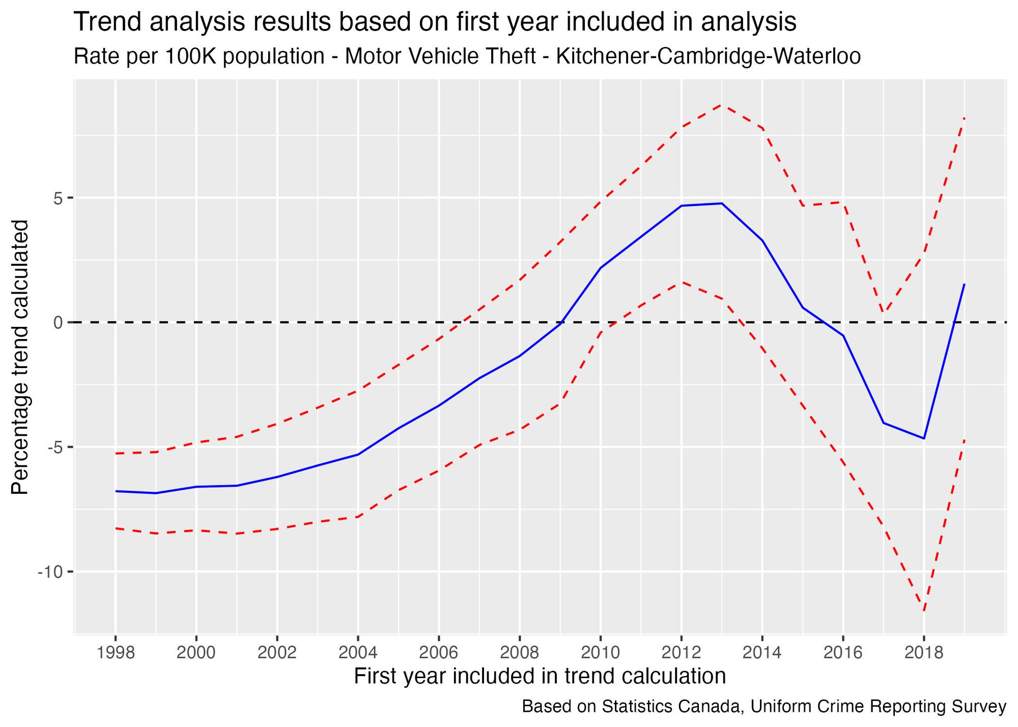
Even though the trend calculation moves negative in recent years, I'd stop short of concluding that this statistic is trending downward. The last point on the graph is based on only 4 points of data, and there is a high level of uncertainty – so concluding that this rate has been essentially flat in recent years is a more reasonable conclusion.
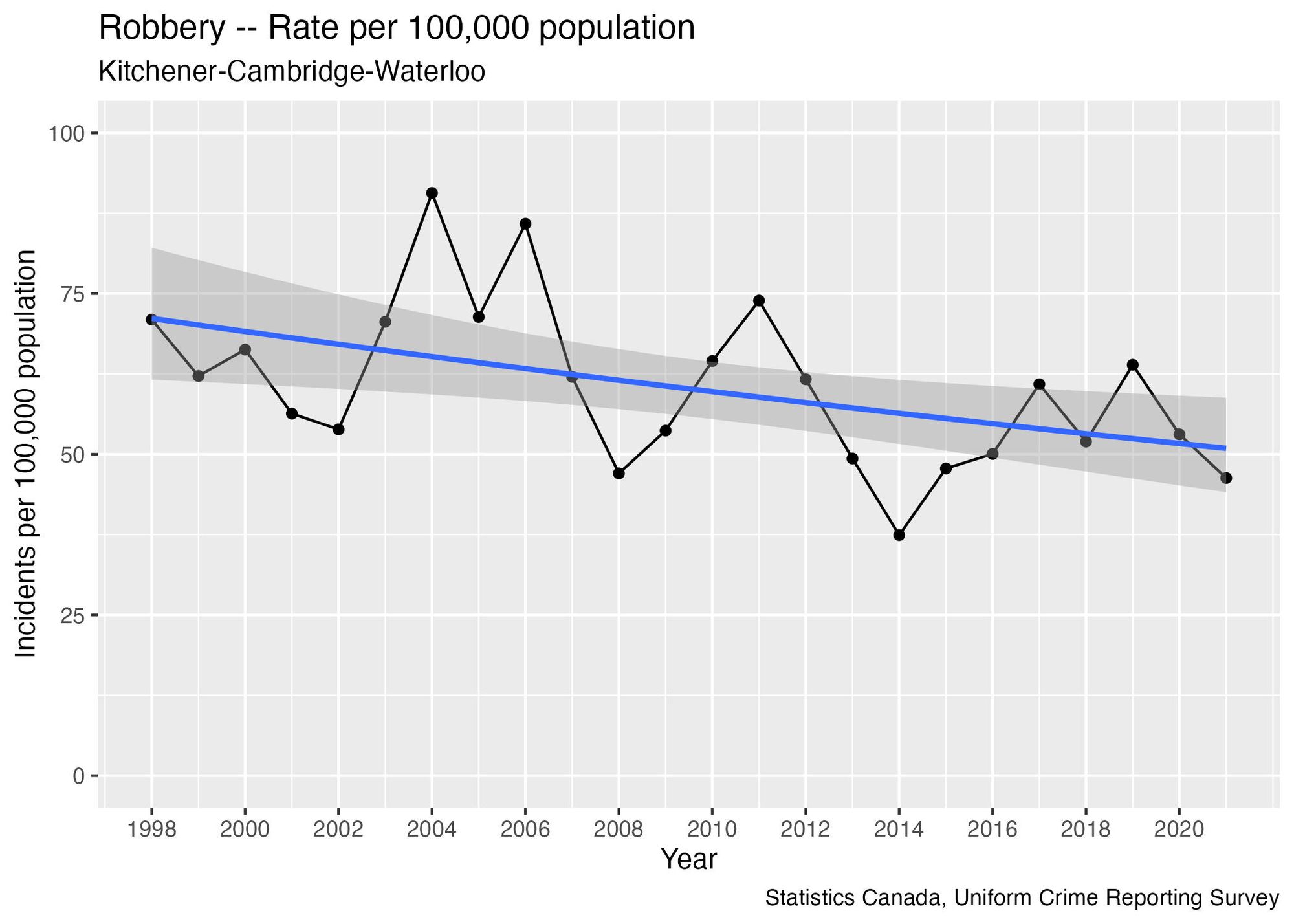
Robbery
The reported rates of robberies since 1998 show significant fluctuations, alternating wildly between increases and decreases. This volatility makes year-over-year changes essentially useless for predicting future trends:
Let’s try a trend analysis anyway to see what the results look like:
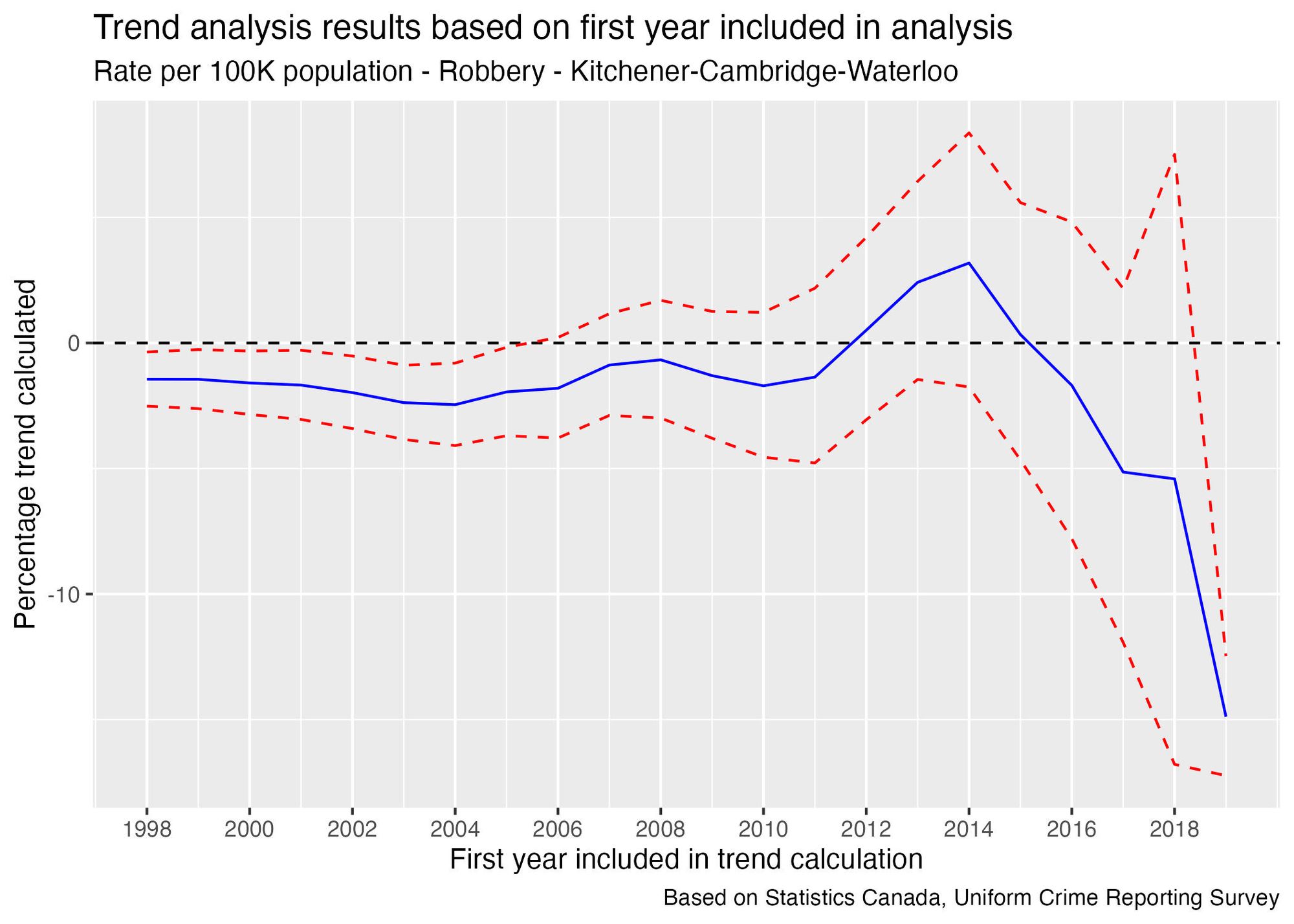
There is a slight decreasing trend when analyzing data going back to 2004 or earlier. However, no recent point provides a reliable trend. The historical volatility is evident from the distance between the red lines: since 2007, the top red line consistently stays above 0, and the bottom error line remains below, leading to uncertainty about whether the trend is increasing or decreasing in recent years.
A more plausible explanation is that this rate shows significant year-over-year volatility and fluctuates around a flat line. Over the 1998-2021 period, half of the time, the year-over-year change was 20% or more in either direction. This context helps us understand what changes are "normal" in this statistic when examining year-over-year data. In 2022, the rate was 61, consistent with levels seen between 2015 and 2021.