Debunking the Police Part 1: Subjectivity in Mathematics
Written by Craig Sloss, Edited by Fitsum Areguy
Introduction
In January 2023, the Waterloo Regional Police Services (WRPS) requested an $18.3 million increase in its operating budget. However, their budget justification memo contained statistical claims that were unproven, misleading, or incomplete. To debunk these claims and provide additional context, I posted daily Twitter threads for two weeks leading up to the Regional Council’s budget meeting.
This issue is the first of a series based on the analysis in these threads, with each illustrating how residents can apply specific data science concepts to critically assess statistical claims in political discussions. I will start by discussing the subjectivity of data analysis and how the decisions made during the analytical process can impact the conclusion. I’ll illustrate this concept by examining this statement that the WRPS made in their budget justification memo:
With our deep commitment to public safety, these frontline investments are necessary now to ensure WRPS is able to keep pace with population pressures and the increasing rate of crime across the Region.
Specifically, I’ll debunk the claim that there is an “increasing rate of crime across the Region” by attempting to reproduce the conclusion using an independent data source.
The misuse of mathematics can be a potent weapon in politics, because it gives the illusion of objectivity to a process that is fundamentally subjective. I think the reason this happens is because there are steps in mathematics that are objective: if you plug some numbers into a formula, you will get an unambiguous, objective answer... but there are so many decisions that get made during the analysis that the result ends up being a subjective one. Take for example the following questions that analysts must consider:
- How relevant is the data to the decision you’re trying to make?
- What biases does this data contain?
- What method did you choose to analyze the data, and do different choices lead to different conclusions?
There is even subjectivity in how results are communicated – do you say that reported crime rates have increased (a verifiable statement about the past) or do you say that crime is increasing (an opinion about what will happen in the future)?
Given the many opportunities to make decisions that “get the result you want,” it’s so important to critically examine these decisions to ensure they are not being abused.
[I will also post the code I used to analyze the data in a Github repository, for those who are interested in applying these techniques in other jurisdictions.]
Reported Crime Rates
To verify the WRPS’ claim of an increasing rate of crime across the Region, I checked to see whether it was supported by data from Statistics Canada’s Uniform Crime Reporting Survey (UCR). I specifically looked at the rate of reported incidents per 100,000 people, which is just one of several ways to measure reported crime, to see if I could get results similar to what WRPS claimed. I will explore other methods, such as the Crime Severity Index, in a future issue.
This brings us to the first question we should ask about the analysis: how relevant is the data to the decision you’re trying to make? The WRPS memo supposedly supports a decision to increase the police budget, but there is no evidence to prove that larger police budgets are associated with lower reported crime rates. So, a statement about an “increasing rate of crime across the Region” isn’t relevant to a budgetary decision.
It's important to understand that “crime data” doesn't represent all crimes. It only reflects the number of incidents reported to the police. As Statistics Canada explains, the UCR data is "a subset of all crimes occurring in Canada but is an accurate measure of the number of incidents of crime being reported to the police."
The reason that there is a difference between “crime” and “reported crime” is because many crimes go undetected. Accurate data on crime rates doesn’t exist, and that includes the data used by WRPS.
This brings us to the second question: what biases does this data contain? In this case, the data will be biased by police decisions about what types of crimes they focus their efforts on detecting, as well as the overall amount of capacity they have available to detect crimes. We can’t determine if a trend is due to a real change in the crime rate, a change in the rate at which police detect crime, or a combination of the two. The WRPS statement is misleading because they chose to refer to an “increasing rate of crime” rather than an “increasing rate of reported crime.”
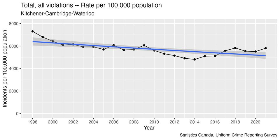
But can we say that there is an “increasing rate of reported crime?” Here’s what the data looks like (I’ve added an automatically-generated blue trend line that describes the overall trend as best it can):
When I calculated the size of this trend line, I found that reported crime rates have been decreasing overall by about 1% per year since 1998. However, there are several problems with my initial analysis....
How many data points to use?
The trend line isn't a great fit for much of the graph, and there are long periods when the rate is consistently above the trend line, and periods when it's consistently below. This happens because it looks like there have been shifts in the direction of the trend over time: decreasing to a minimum point in 2014, then increasing for a few years, before starting to flatten out again. The older data may not be relevant to what’s happening today.
One way to come up with a trend that’s relevant in 2023 is to remove some of the older data points and calculate the trend using more recent data. This is a balancing act: we want to have enough data points so that we’re confident in the trend, but the older the data is the less relevant it becomes.
Researchers have to choose a cutoff point for the data during the analysis, which introduces another layer of subjectivity to whatever conclusion they arrive at.
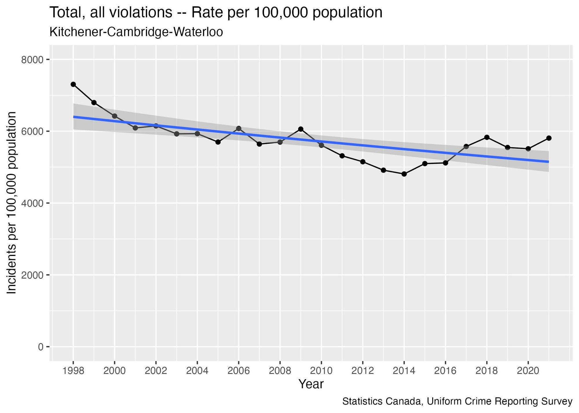
Here’s an example showing that if we only use the 8 most recent data points, we get a trend line that is increasing rather than decreasing:
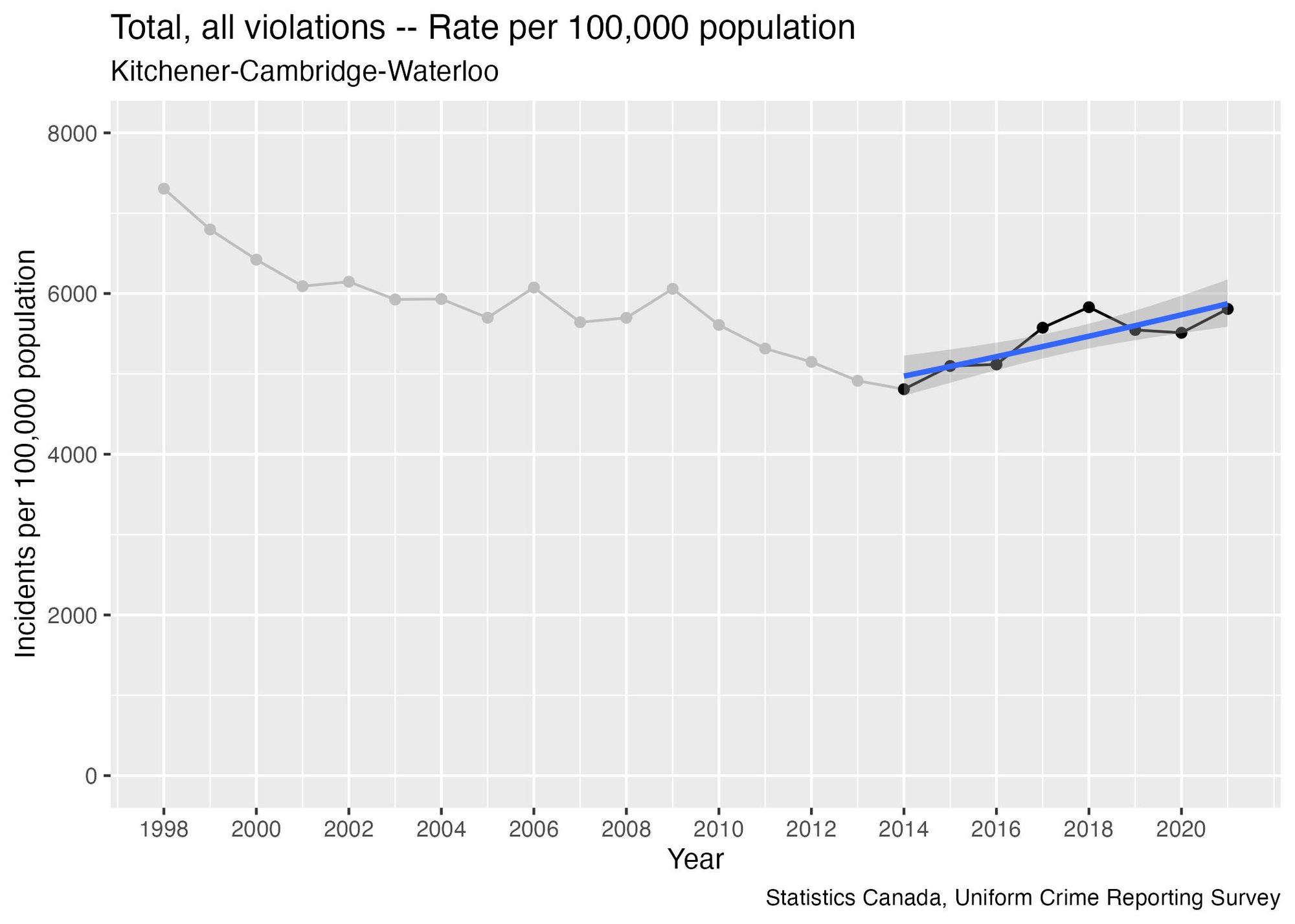
But if we only use the last four data points we get a trend line that is flat:
The key takeaway here is that the analyst can show that rate of reported crime is either increasing, decreasing, or flat, depending on how many data points they choose to include in the analysis.
Trying different methods
This brings us to our third question: what method did you choose to analyze the data? And are there methodological choices that can be changed?
One way to investigate the degree to which an analyst’s decisions have impacted on their findings is by repeating the analysis several times but making a different decision each time. This technique is part of what data scientists call a sensitivity analysis.
If you get significantly different results, it shows that the results are highly dependent on the decisions made during the analysis. But if the results are similar each time, it suggests that your conclusions are more reliable, because they’re less impacted by the decisions you made when doing the analysis.
Using UCR reported crime rate data, I developed a program that automatically re-calculated the trend factor, starting the trend analysis from a different year on each calculation. The graph below shows the results, with the blue line representing the trend calculation and the red dashed lines indicating the level of uncertainty in the estimate. Specifically, there's a 95% chance that the true trend value falls somewhere between the two red lines.
Here’s how to interpret this graph:
- When the blue line is above the black dashed line, the calculation based on these data points shows an increasing trend.
- Conversely, when the blue line is below the black dashed line, the calculation suggests a decreasing trend.
- We have greater confidence in our ability to conclude that the trend is increasing or decreasing when the dashed red lines are both on the same side of the black dashed line.
- However, when the red lines straddle the black line, it becomes ambiguous to tell whether the trend is increasing or decreasing. In this case, it may be more reasonable to conclude that the trend is flat.
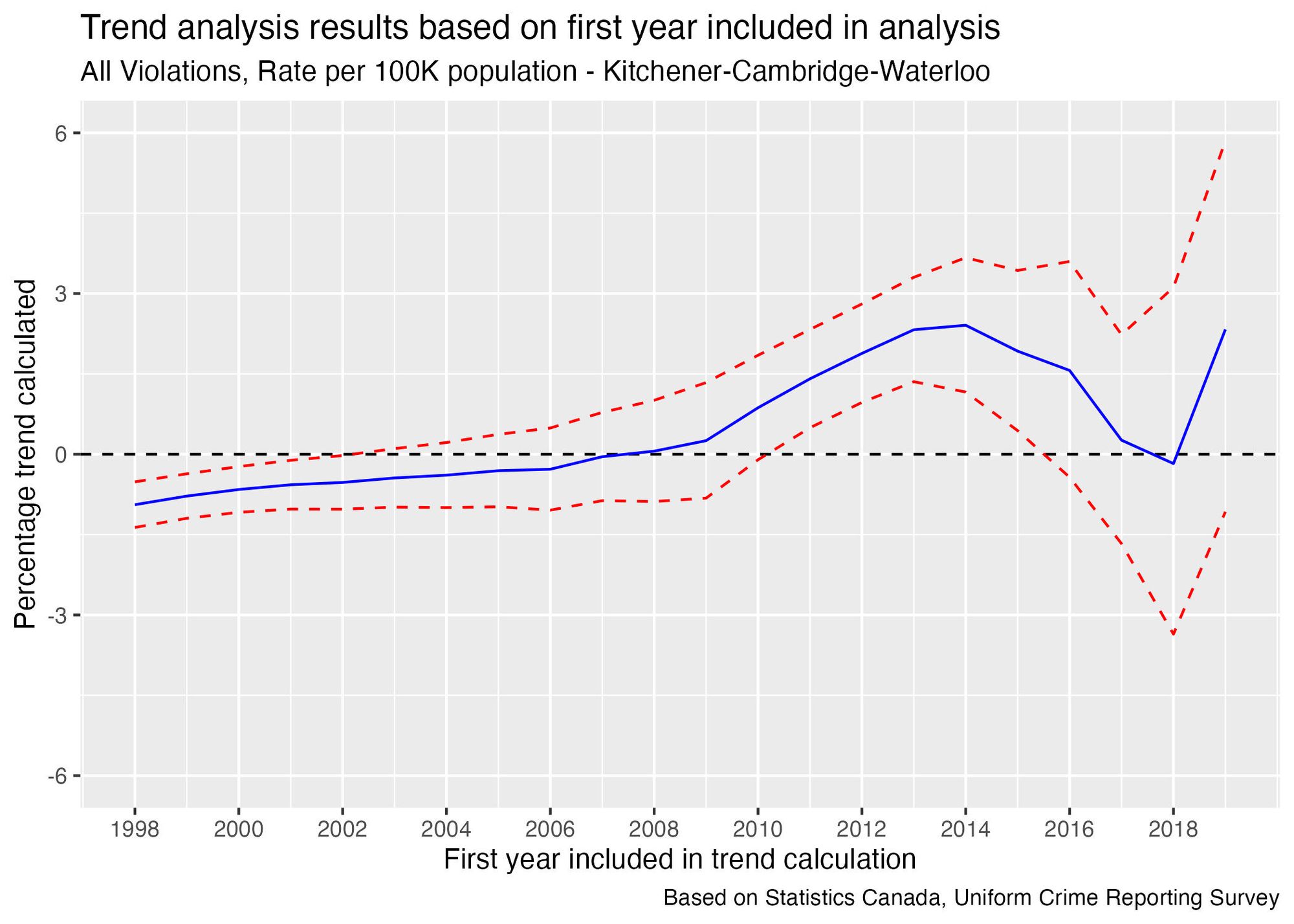
The graph clearly indicates that the choice of where to start the trend line will impact whether it is increasing, decreasing, or flat. It also shows how much the size of the trend depends on this decision.
For example, if we use data going back to 2014, the trend calculation gives a result of 2.4% increase per year, so there is evidence of a medium-term increasing trend. However, 2014 had the lowest reported crime rate of any year since 1998, so using this point to calculate the trend would overestimate its value—in other words, the easiest way to prove something is trending upward is to start your analysis from the lowest point in 23 years!
If we start from 2015 instead, the calculation result is a 1.9% increase per year. Removing a single year from the data changed the result by 0.5%.
In the more recent years we see that the medium-term appears to have dissipated. As we get further from 2014, the calculated trend value continues to decrease. By 2017 the trend estimate is just above 0, and by 2018 it is slightly negative.
This inconsistency—essentially, the fact that we can reverse the direction of the trend by removing just a few points of data—suggests that the medium-term trend may have plateaued, and the short-term trend appears to be flat.
The takeaway from this analysis is that the choice of starting point can significantly influence the trend direction. This is especially important to consider when the person selecting the starting point has a vested interest in the trend direction, making it critical to perform the analysis using different starting points and check if the results are consistent. This is particularly key to bear in mind during political discussions involving statistical analysis.
What does a consistent trend look like?
Since I just showed you an example in which there is ambiguity over whether a statistic is trending, I wanted to show what a more consistent trend looks like in contrast.
This is based on the rate of reports of theft under $5,000, which has been decreasing steadily in recent years, presenting a clear and distinct pattern (it’s worth noting that the WRPS memo did not mention any crimes that were trending downward, but that is a topic to be explored in a future issue).Here’s what this data looks like:
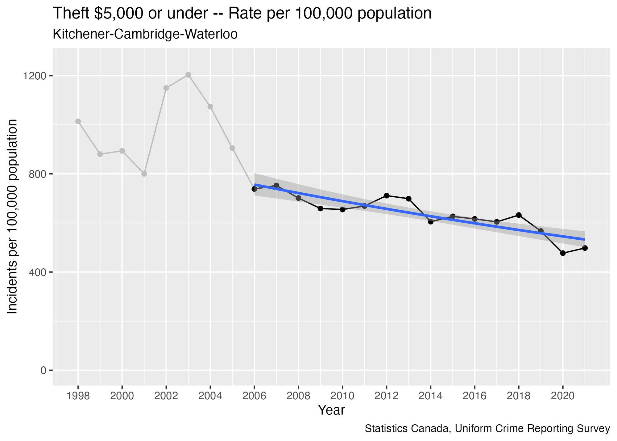
I decided to exclude data prior to 2006 when calculating this trend line, since the points prior to that look like they may be outliers, and the more recent data will be more relevant anyway. We can test the impact that this decision has on the results the same way I did in the previous section:
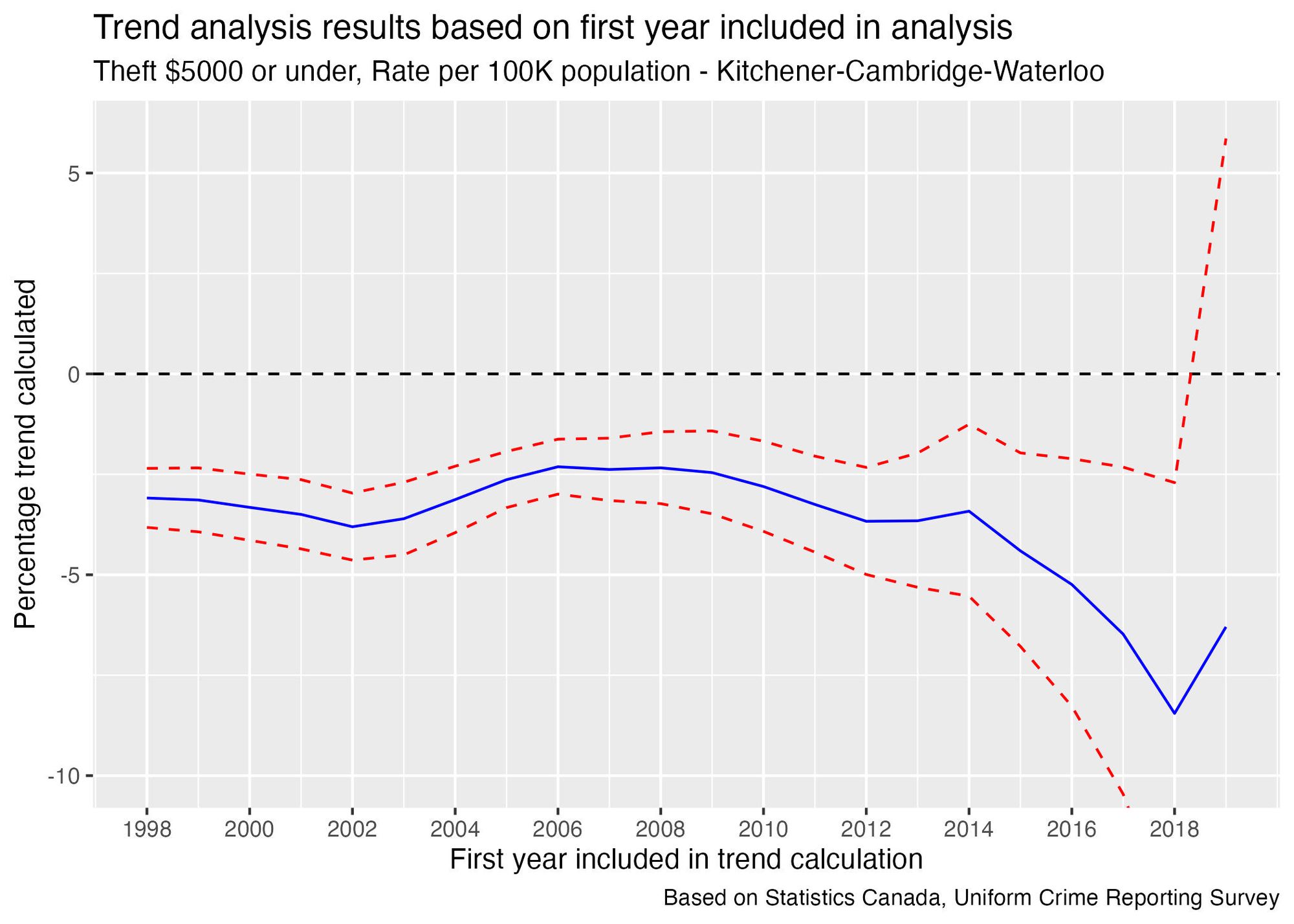
Regardless of which year you use as the starting point, you would conclude that there is a decreasing trend—so there's no opportunity to "cherry-pick" a starting point to get the trend in the direction you want. Even the size of the trend tends to be consistent regardless of which year we use as a starting point.
There is a lot more uncertainty in the size of the trend when using data points after 2015, but the fact that the general direction is consistent with what we see when using the older data points gives some additional confidence that trends calculated using older data haven't started turning around in recent years.
What I hope you takeaway from this is that it’s important to understand how subjective data analysis can be, and question the decisions made during the analysis. By looking at whether the results are consistent, regardless of the decisions made, we can get more insight into how reliable the analysis is.
Coming up in the next issue: I’ll look at the WRPS’ habit of reporting “trends” using only 2 points of data, and explain why this is a misleading way to analyze trends.
If you would be interested in using my code to do your own analysis on this data, you can find it in this file in my Github repository: https://github.com/craig-sloss/questioning_the_numbers/blob/main/police_data/01_subjectivity_in_data_analysis.Rmd